
SELECTED WORKSoul Love Counseling
A little retro. Deeply human. An expressive visual identity for a mental health and art therapy practice.
BRAND IDENTITY & WEBSITE DESIGN
SOCIAL MEDIA
Wellness
the projectRoom to feel. Room to grow.
For a therapist whose work brings together mental health and creative expression, a conventional clinical identity would have missed the point. Nielle wanted a look that reflected her love of the 1970s while feeling personal, inviting, and rooted in her practice.
Design direction: expressive lettering, fluid forms, warm color, and a sense of movement.

the brand IDENTITYSeventies spirit.
Present-day care.
The identity borrows the expressive warmth of 70s design without becoming a period piece. Rounded, character-filled lettering meets earthy shades and loose, flowing forms that suggest movement, openness, and individuality.
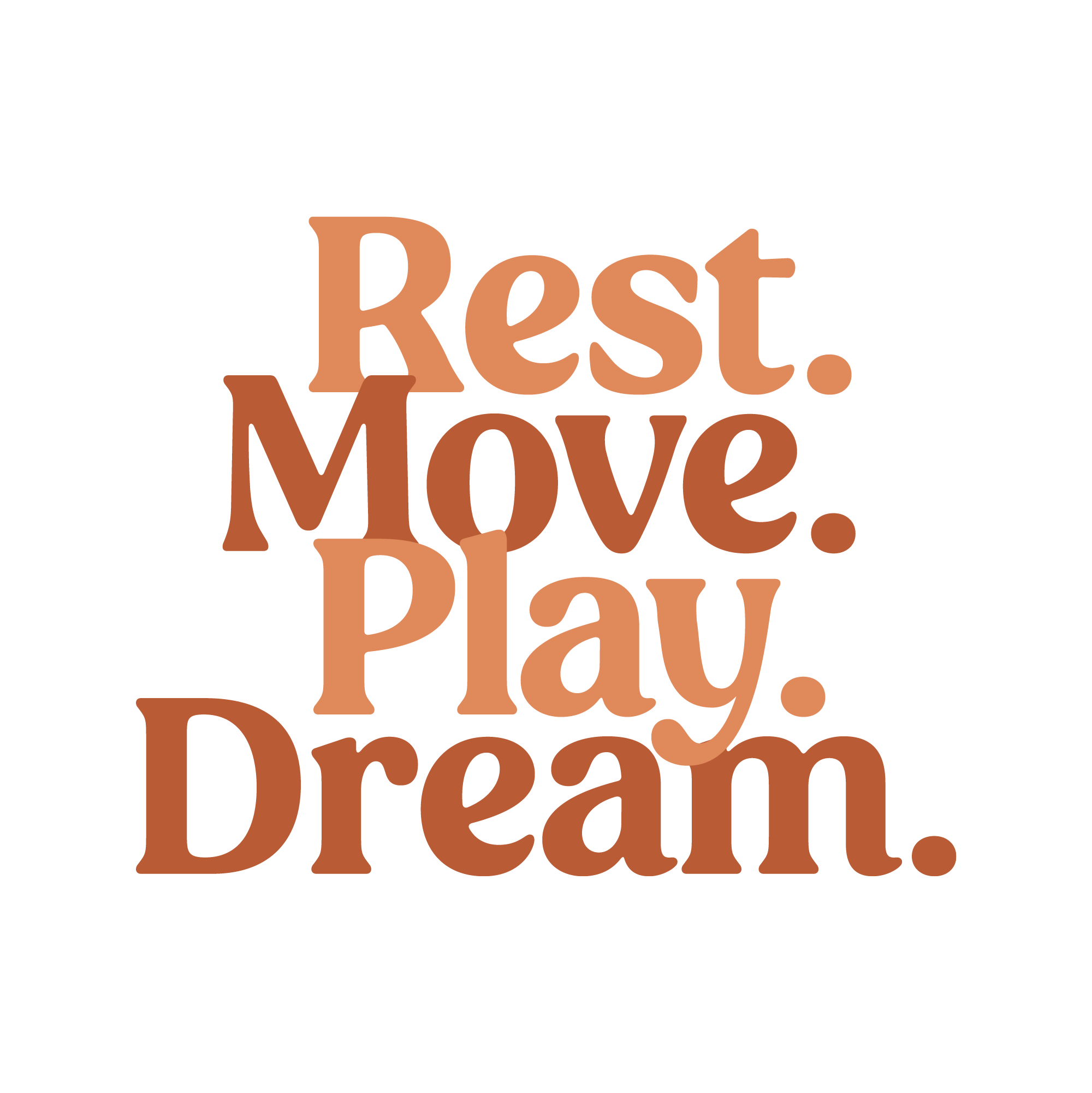
Rest. Move. Play. Dream.
the elementsThose four words appear throughout the identity and give the brand its distinctive rhythm. The graphics can be quiet and reflective or full of life, while staying connected through type, color and organic movement.
Details with personality.
in practice
An invitation
to connect.
Launch communications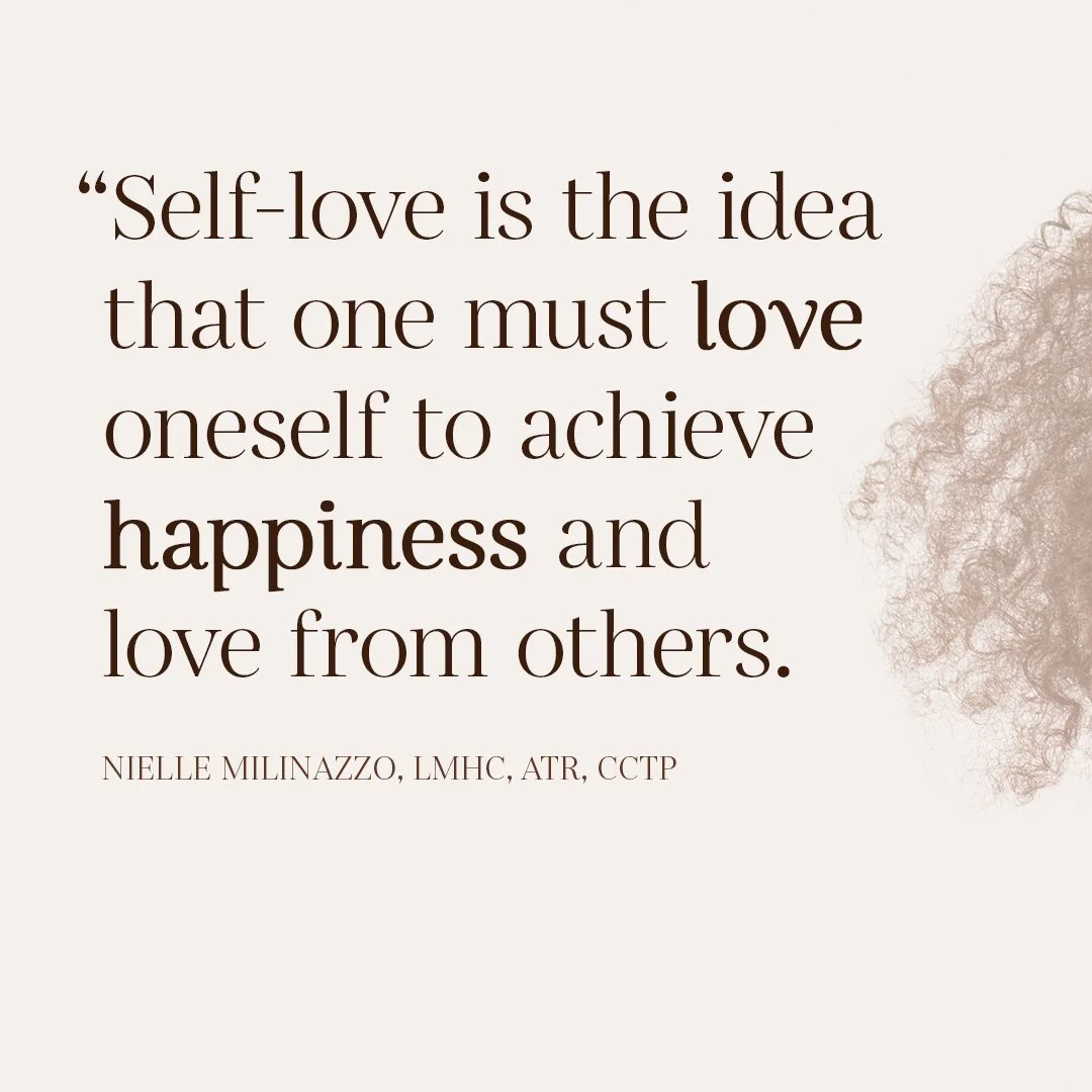
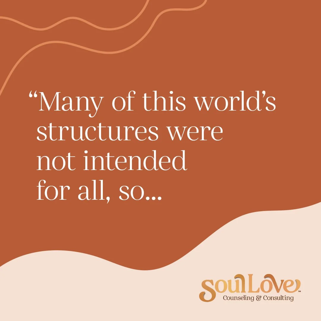
Launch graphics use portraits, oversized type and softer moments of reflection to introduce the practice's tone. Rather than feeling clinical, the visual language makes space for energy, care and self-expression.

The identity,
online.
Website designThe website extends Soul Love's expressive identity into a digital experience, carrying its warm palette, distinctive typography and flowing visual language beyond print and social media.
The outcomeA brand with
space for every
part of you.
The completed identity connects Nielle's love of 70s aesthetics with her work in mental health and art therapy. Across logo, stationery, social content and motion, Soul Love has a distinct, expressive visual language that feels consistent without being rigid.